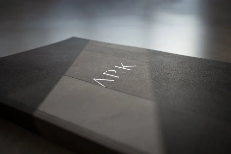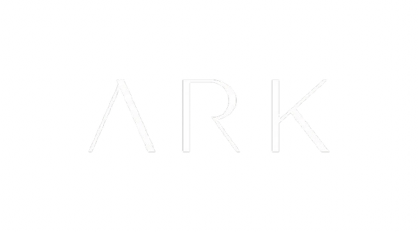
At ARK Architects, we have been bringing the dreams of those who trust us to life for over a quarter of a century. To celebrate this milestone, we have refreshed our image with a more sophisticated logo, also marking the international expansion the company is embarking on.
Manuel Ruiz Moriche, co-founder and creative director of ARK Architects, has led the company’s rebranding with an approach that blends tradition and modernity. His vision has been key in creating a sleek, elegant design that reflects ARK’s evolution toward international expansion while maintaining its essence. The new logo, with its balance of classic and contemporary elements, conveys the subtlety and attention to detail that define ARK’s spaces, always focused on offering a refined lifestyle connected to nature.
The new image had to be consistent down to the smallest detail, starting with the logo and developed conceptually and graphically with a solid unity. This is why we referenced other high-status international brands established over time, which have undergone a similar process of refinement.
In addition to offering excellent quality products, ARK also sells a personal experience and a sense of belonging for the client. The product serves as a vehicle to embrace a desired lifestyle on a personal level, and the use of appropriate iconography speaks to social status.
This new logo merges tradition and modernity, representing the subtlety in spaces, the use of light and materials focused on a lifestyle that is both everyday and sublime, a hallmark of ARK’s work. Sophisticated yet comfortable homes, designed to provide a sense of well-being that maximizes the possibilities of the status achieved through our connection with nature.
To achieve this change, we drew on classic typography elements like varying thicknesses, abandoning the limiting serifs and opting for the sobriety of new sans-serif fonts, with varying thicknesses and white space that convey these sensations.
The new design does not rely on trends or strong graphic accents that might affect perception in other countries due to cultural or visual differences. Instead, it seeks the timeless, the classy, the sophisticated, and the elegant, embodying the essence of ARK’s work.
The perception will tell us that “something has changed” in ARK in a positive way, as the new sensations produced are aligned with elegance, timelessness, and graphic sobriety, creating the feeling that ARK is no longer a local company.
Evolution of our Logo